The websites for MIA, Childish
Gambino and The Cranberries are all aesthetically and stylistically different,
however the main aspect of all of them which connects them is that they all are
advertising their latest album release, through direct references to the album,
as well as through colour schemes and imagery
 MIA’s website features a
repeating, horizontal line flag like design of orange, black and an
off-white/pink colour. This connects with the flag imagery in the centralised
orange box, which displays an album bundle for sale including a flag with logos
on it, the CD as well as vinyl which is green instead of orange as an incentive
to buy the more expensive product. Below this are the usual links to streaming
platforms such as Spotify, Apple Music, Google Play etc. Also included below
this on the page is a download link to the logos used on the flag, showing a
synergistic link between the branding of the website and of the album. The
final piece of screen real estate utilised on the home page of this website is
a table for European tour dates. The colour scheme of this page represent a synergy
between the products associated with MIA, all centralised around her 2016 album
AIM, the website is even called M.I.A. // A.I.M. Interestingly on the Buy Now
tab, the following page requires a password to get in, this may be incentive to
purchase a physical copy of the album to gain access to merch. There are no
references to a record label on the website, despite running her own label
N.E.E.T recordings. – perhaps the reasoning behind starting a label was to do
with artists creative control, so the absence of a company logo would be on
brand for MIA in this sense. The audience can interact with MIA on this website
through links to twitter, Facebook, Instagram and Tumblr. The use of flowers,
books and hands making a bird shape convey peace which compares and contrasts
with MIA’s aggressive music going against authority.
MIA’s website features a
repeating, horizontal line flag like design of orange, black and an
off-white/pink colour. This connects with the flag imagery in the centralised
orange box, which displays an album bundle for sale including a flag with logos
on it, the CD as well as vinyl which is green instead of orange as an incentive
to buy the more expensive product. Below this are the usual links to streaming
platforms such as Spotify, Apple Music, Google Play etc. Also included below
this on the page is a download link to the logos used on the flag, showing a
synergistic link between the branding of the website and of the album. The
final piece of screen real estate utilised on the home page of this website is
a table for European tour dates. The colour scheme of this page represent a synergy
between the products associated with MIA, all centralised around her 2016 album
AIM, the website is even called M.I.A. // A.I.M. Interestingly on the Buy Now
tab, the following page requires a password to get in, this may be incentive to
purchase a physical copy of the album to gain access to merch. There are no
references to a record label on the website, despite running her own label
N.E.E.T recordings. – perhaps the reasoning behind starting a label was to do
with artists creative control, so the absence of a company logo would be on
brand for MIA in this sense. The audience can interact with MIA on this website
through links to twitter, Facebook, Instagram and Tumblr. The use of flowers,
books and hands making a bird shape convey peace which compares and contrasts
with MIA’s aggressive music going against authority.
Childish Gambino’s website, it
titled Donald Glover Presents. This may show that Glover is beginning to separate
himself from the “Childish Gambino” name, and many believe that his last album “3.15.20”
will be his final under the pseudonym. The stylisation of the website is akin
to that of the album, in that it is a plain white with no other stylisation.
Look closely and you can see in a faint pink is “Donald Glover Presents” and
below it “Music”. The blank aesthetic of the album as well as its ‘demo’ and
unfinished style that it is going for, shows possible inspiration from Kendrick
Lamar’s 2016 release “Untitled Unmastered”. Click on the music tab and you get
redirected to a smarturl page, with the album and all the streaming services
linked. There is nothing else on the website, the minimalist style reflects the
aesthetic of his new album, there are no links to social media platforms or any
record label.
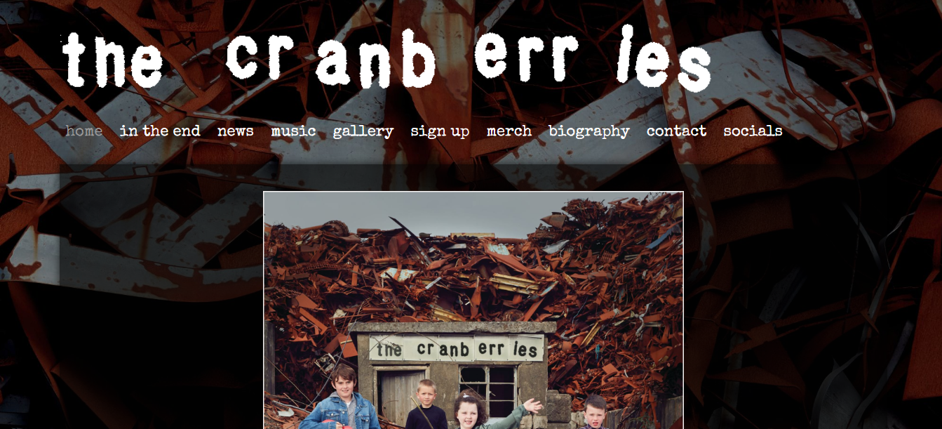 The Cranberries Website has much
more content compared to the other two, featuring numerous tabs titled: “Home,
In the end, news, music, gallery, sign up, merch, biography, contact, socials”.
The website uses the Cranberries logo as seen in the album cover for “In the
end” as the header of the page. The background of the site uses the rust
covered scrap metal dumping ground as seen in the background of the album
cover. The home page also utilises descriptive text, unlike the others which marketed
their brand using semantics alone. “Announcing the album, the band has shared
the first single ‘All Over Now’ that blends rock, alternative and catchy almost
pop-sounding melodies to deliver a classic Cranberries sound “ The bottom of the home page features a
graphic to show the album was nominated for best rock album at the 2020 Grammy’s.
This website feels more like an archive as opposed to the other two, in that it
is more utilised to document the Cranberries activities over their career
rather than just advertise the latest release – which links to the passing of
the lead singer in 2018, although there is heavy branding in relation to this. There
is the option on every block of text and graphic to share on Facebook and
twitter, and as well as the contact and socials tabs, this shows high amounts
of audience interactivity. There is again, no evidence of record label
branding, in the era of streaming it could be argued that the focus when
finding a new band to listen to is less focussed on if they are signed to a
mutual record label as someone you already enjoy. The design and aesthetics of
this album and website with the rust and using children to portray the band
members gives it a sense of nostalgia as well as playing into classic genre
conventions for rock music. Embedded in the website home page is the latest
music video “All Over Now”. Advertising their music video to the audience.
The Cranberries Website has much
more content compared to the other two, featuring numerous tabs titled: “Home,
In the end, news, music, gallery, sign up, merch, biography, contact, socials”.
The website uses the Cranberries logo as seen in the album cover for “In the
end” as the header of the page. The background of the site uses the rust
covered scrap metal dumping ground as seen in the background of the album
cover. The home page also utilises descriptive text, unlike the others which marketed
their brand using semantics alone. “Announcing the album, the band has shared
the first single ‘All Over Now’ that blends rock, alternative and catchy almost
pop-sounding melodies to deliver a classic Cranberries sound “ The bottom of the home page features a
graphic to show the album was nominated for best rock album at the 2020 Grammy’s.
This website feels more like an archive as opposed to the other two, in that it
is more utilised to document the Cranberries activities over their career
rather than just advertise the latest release – which links to the passing of
the lead singer in 2018, although there is heavy branding in relation to this. There
is the option on every block of text and graphic to share on Facebook and
twitter, and as well as the contact and socials tabs, this shows high amounts
of audience interactivity. There is again, no evidence of record label
branding, in the era of streaming it could be argued that the focus when
finding a new band to listen to is less focussed on if they are signed to a
mutual record label as someone you already enjoy. The design and aesthetics of
this album and website with the rust and using children to portray the band
members gives it a sense of nostalgia as well as playing into classic genre
conventions for rock music. Embedded in the website home page is the latest
music video “All Over Now”. Advertising their music video to the audience.Overall the three websites, all advertise an album release, however Childish Gambino’s is much more abstract than the other two, and The Cranberries features more information about the band as a whole rather than just their latest project. Record Labels are nowhere to be seen in regards to the websites, focusing more on the ideology of the artist and the album, also the synergy between the latest release for an artist and the website is very strong in all examples, and the stylisation of the album completely takes over the look of the website.
Comments
Post a Comment